

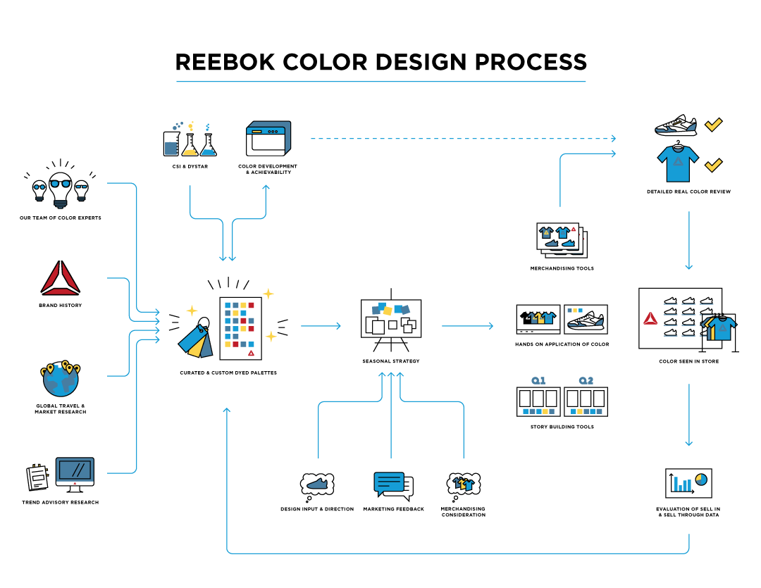

Reebok Icons
I had the opportunity to work on a project for Reebok at their HQ in Boston. While there, I created an infographic for their Color and Trend Team that utilized a ton of custom icons! Here are some looks at a few of the icons up close, the infographic sheet, and a process page.
Client: Reebok


Artificial Reality “H” Logo Concepts
I consulted with Harvin AR, an artificial reality company, about their logo. I proposed logos that created the illusion or feeling of dimension or integration on flat surface where they would be displayed. Alternatively, I also played with some abstract “AR” marks based on light waves and how artificial reality is represented in technical diagrams.
Client: Harvin AR, unpublished
Arnold Todaro Welch & Foliano Logo
With the addition of Foliano as a partner to the firm, Arnold Todaro & Welch needed an update to its logo to reflect this change. They wanted a strong, clear, classic wordmark. Only a small, minimal graphic element was utilized, drawing on the common symbolism of the scales of justice and putting the entire team into perfect balance.
Client: Arnold Todaro Welch & Foliano


Dayton FLUD Logo
University of Dayton FLUD Ultimate Frisbee Team wanted a unique badge logo for their team gear. They had been using older University graphics that didn’t quite match the sport or the team. We created a modern & minimal, yet bold & playful badge that is reminiscent of classic soccer crests. Also pictured: alternate direction for the logo that we did not pursue because it didn’t quite fit the personality of the team (but was fun).
Client: University of Dayton FLUD


Alphonse DePalma III Logo
A logo created for my father! Minimal and versatile. For personal, sport, apparel, and business uses. Also pictured, some renderings of how this logo could look anywhere and everywhere.
Client: Alphonse DePalma III

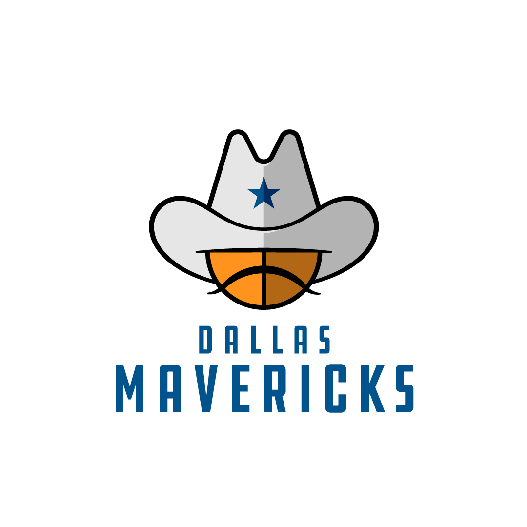
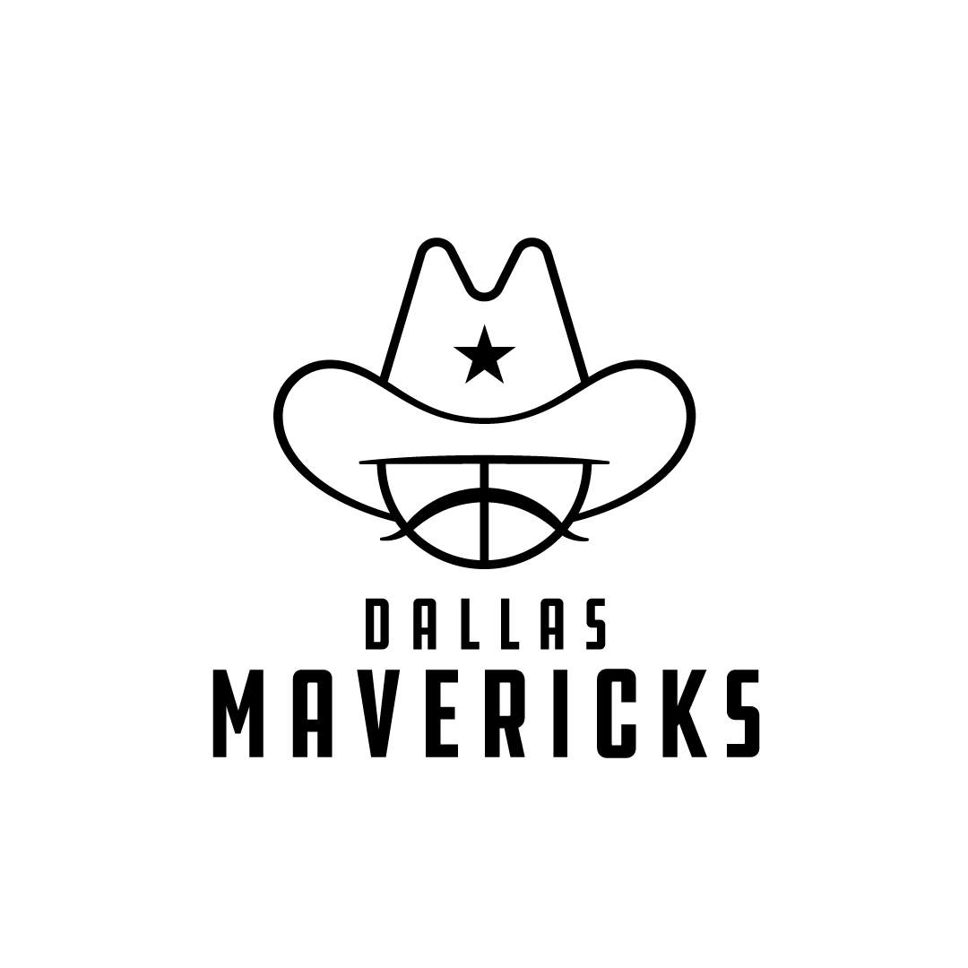
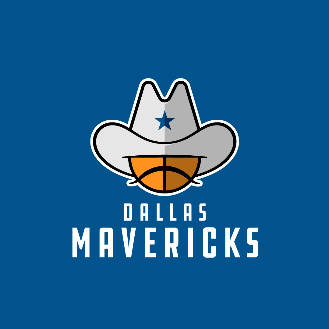
Dallas Mavericks Redesign Concept
In my opinion, the current Mavericks logo is a bit complicated. I felt like there could be a solution for them that would be more simple, clear, and fun.
Personal project


New England Revolution Redesign Concept
The Revs have had the same logo since their very first season in 1994, but it has not aged well. The team has been incorporating some more elements of the New England flag in their kits of late, so it seemed like a good time to think about committing to that imagery and making the badge feel more like it belongs to a soccer club.
Personal project


Mookie Betts Logo Concept
MB + 50
Mookie once looked to his followers on social media because he needed a logo. He had no requirements, so I combined initials, jersey number, and a baseball element in my submission. (In the end I believe he picked a submission that was plagiarized and abandoned the logo altogether.)
I also mocked up how this logo could look on some of his Jordan cleats (3rd image).
Personal project


Rey Mysterio Logo Concept
R + ?
Logo concept drawing from elements of Rey Mysterio’s iconic mask.
Personal project